Make Your Charts Easier to Read – 4 Tips

Charting a course
You must have come across charts that are a pain to read. They might look pretty on first glance, but when you actually try to understand what they are showing you, they become unbearable. Perhaps they are overloaded or simply have too much visual clutter. So, how do you make your chart more readable and still informative? That’s the topic of this post. We will share with you five simple tips that will help you create effective, clean charts to get your message across.
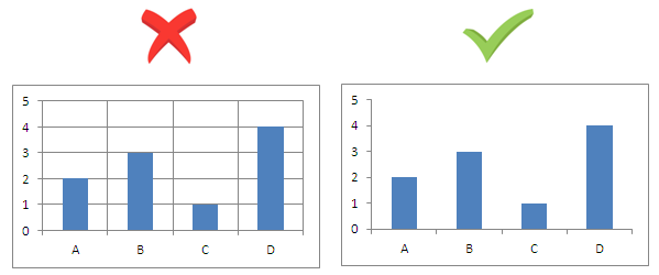
Avoid Grid Lines
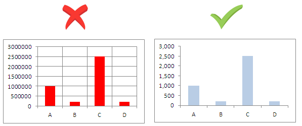
If you are doing a bar chart, there is no need for vertical lines! Even horizontal lines can be avoided if the data can be read against the values on an axis. If not, you may consider keeping them. You may also consider using light colors or various tones of grey to serve the purpose. See which one looks better!
Avoid Shocking Colors
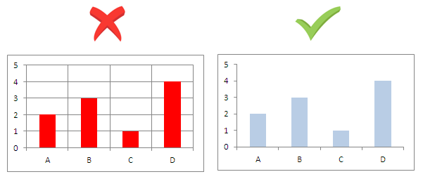
The default colors of charts might not be best colors to use. Try using colors that have harmony within them and pastel shades so that readers feel comfortable when reading your reports. You can also use variations of tone within a single color to make your charts look more professional.
Use appropriate Units to represent the data
You may have data with very large or very small numbers. With financial data, it is very common to have data grouped by millions and billions of dollars so be consistent with the units and take up a suitable unit to present the figures. Too large or too small figures can be troublesome to read and understand.
Additionally, if you are targeting an audience that can understand scientific types of charts, you can consider using log-scales to plot wide ranges of values.
Avoid Cluttering Charts
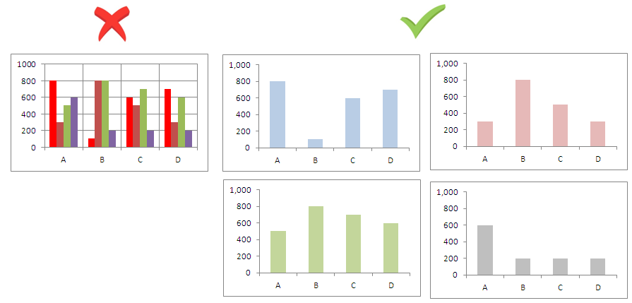
Avoid overloading charts with too much data. It is not always necessary to put every bit of information in to a single chart. Divide your data into meaningful segments and present it accordingly. Remember; the purpose of a good chart is to help understand data not to put it all out there at once.
